


Brooklyn's J'Ouvert is a pre-dawn celebration rooted in Caribbean tradition, but for years its cultural significance was buried under public safety concerns and negative press coverage.
The 2015 Labor Day weekend became a turning point when Carey Gabay, a member of Governor Cuomo's administration, was fatally shot in the hours surrounding the celebration. The incident prompted a citywide reckoning with how J'Ouvert was being characterized, and a coalition led by the administrations of Mayor de Blasio and Brooklyn Borough President Eric Adams formed to change the narrative.
I joined the campaign in 2017 as part of a small creative team, owning all design and image selection from the start. After a pause during the pandemic, Yvette Rennie of J'Ouvert City International invited me to return as the sole creative. I expanded my role to include copywriting and social media, and launched wearejouvert.com in June 2024.

The Challenge
The campaign had a clear purpose but an unfinished creative voice. Safety messaging existed, but it needed a visual and narrative system capable of holding two truths at once: honoring J'Ouvert's cultural significance while giving the coalition a consistent, credible public presence. Upon returning after the pandemic, the task expanded to building a lasting digital infrastructure to carry the work forward.

Process & Design Approach

Visual Identity
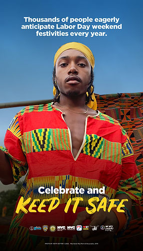
Peace and unity were the pillars of this initiative. A peace sign formed from Caribbean flags speaks directly to the immigrants and their descendants who gather in Brooklyn every Labor Day. The brushstroke typeface references the mud, oil, and paint worn during J'Ouvert, a nod to the molasses and sugarcane plantations that define its origins.
Colors
#ffffff
#871f1f
#5691a7
#477b44
#000000
#570100
#3a4a8f
#c6a426
Fonts
Gotham, Fira Sans, Rustico

Core Poster System
The original poster direction was developed collaboratively within a creative committee. I owned the design, image selection, and eventually the copywriting throughout. The system evolved into three anchor posters, each with a distinct intention:
“We Are J'Ouvert”
Cultural pride
“J’Ouvert Details”
Safety & logistics
“Celebrate and Keep it Safe”
Safety and joy
Each summer, the visuals were refreshed and distributed across NYC.gov/jouvert , LinkNYC kiosks throughout Brooklyn, and printed flyers.


Phased Rollout
A companion set of "Dawn. The Opener" posters extended the campaign across the full summer. Two debuted in June for Caribbean Heritage Month, two more followed in July, and the core three ran in August ahead of Labor Day. The sequencing kept J'Ouvert culturally visible from the start of carnival season through the weekend itself.


Digital
Infrastructure
Designed and launched
wearejouvert.com in June 2024 on WordPress using the Divi framework, built for mobile responsiveness with Google Analytics tracking.
The newsletter, managed through Mailchimp, delivered safety tips, cultural stories, and sweepstakes announcements with visuals consistent with the campaign identity.
Campaign
Extensions
Carnival in the City
The campaign extended into an annual gallery partnership with Resorts World Casino's Red Wall Art Gallery, with exhibitions running August 1–September 7 in 2017 and 2018, reaching an estimated 10,000 daily visitors each year.
Results & Impact
LinkNYC
-
62 kiosks across Bed-Stuy, Crown Heights, Midwood, East Flatbush, Flatbush, and Prospect Heights
-
14-day flights across June, July, and August in the final campaign year; 30-day flights in previous years
-
Estimated 244M+ impressions across seven campaign years, based on Geopath network averages
Website
-
4,324 total page views
-
2,365 first-time visitors
-
738 peak users on a single day, driven by direct traffic
Newsletter
-
67.6% open rate
-
13.5% click-through rate
-
Zero unsubscribes or complaints.

Stakeholder Coordination
Creative work was reviewed and approved each season by an evolving coalition spanning two mayoral administrations, multiple borough presidents, NYPD leadership, and cultural organizations including J'Ouvert City International and WIADCA. Maintaining a consistent creative voice across years of leadership transitions was as much a part of the work as the design itself.
Tools Used
Illustrator, Photoshop, WordPress (Divi), Mailchimp, Google Analytics
Special Thanks To
-
Pastor Gil Monrose and the entire Labor Day Weekend Safety coalition, whose sustained organizing created the foundation this campaign was built on.
-
To Yvette Rennie of J'Ouvert City International, whose advocacy for J'Ouvert made this work possible and whose invitation brought me back to it.
-
To Karen Valentine, whose vision, relationships, and leadership made the Carnival in the City exhibitions and much of this campaign's early reach possible.
-
To Roy Pierre, recognized for his enduring contributions to traditional J'Ouvert portrayal and his lasting impact on Brooklyn Carnival.
-
To Keith Getter, thank you for years of photographing J'Ouvert with honesty and care. Your images gave this campaign its soul.