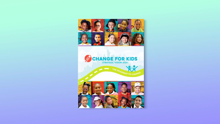
Change for Kids
2020 Vision Document
Publication Design
In 2020 Change for Kids, a youth development nonprofit that once focused on supplementing public schools, was forced to reimagine its mission in response to the COVID-19 crisis. As the pandemic deepened systemic inequities, the organization pivoted to support the whole child, moving from program-based enrichment to a broader vision of student agency, equity, and opportunity.
To communicate this shift to board members, funders, and lawmakers, I was brought in to design a strategic vision document that could articulate both the urgency of the moment and the long-term values behind the new direction.
The Challenge
The content was dense, conceptual, and emotionally charged. Our goals were to:
-
Visualize the connections between mission, vision, values, and programming
-
Make a layered document feel easy to read, but still worthy of re-reading
-
Balance clarity and creativity while keeping the message policy-relevant and community-centered


V 1
Process
I worked in close partnership with the Senior Director of External Engagement, who led the strategic planning process. She would often sketch her thinking by hand, mapping how ideas were connected across the document, and I translated those into infographic roughs and multi-page layouts.
We went through 28 versions, using a shared folder, Zoom sessions, and email threads to track feedback and iterations.
What I Learned
This project was a reminder that good design isn’t just about visual clarity, it’s about helping people rally around an idea. The core challenge was to communicate a strategic shift: why it was necessary, how it would unfold, and what it meant for the future of the organization. The content needed to build trust and understanding while still inspiring support, and the design had to carry that weight without overwhelming the reader.
V 10
Over the course of 26 versions, I learned that sometimes the most elegant solution isn’t the most complex, it’s the one that helps people get it. We explored several infographic styles early on, but it wasn’t until we reframed the story around a visual “roadmap” that things truly clicked. Even when I had initial doubts about certain ideas, I made space for them in the process so we could test, learn, and evolve the design collaboratively.
V 20
I was taught early on that strong design serves the message first, and this project reinforced that belief. It was a lesson in patience, simplification, and structured storytelling.


